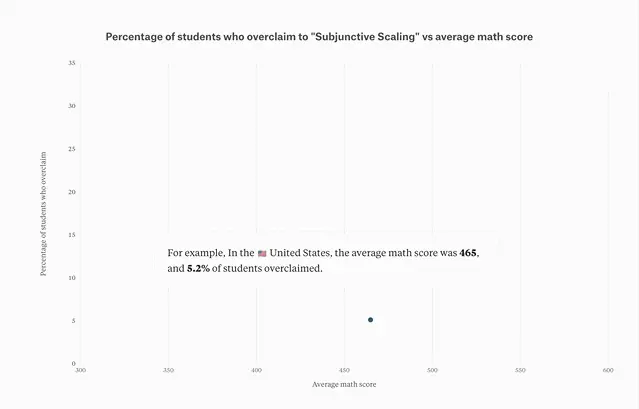
Do students around the world think they know more than they do?
Exploring student self-perception of knowledge using PISA data
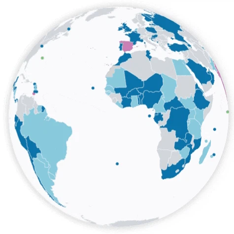
Exploring Data with a Rotating Globe
Creating a rotating globe from design to deployment.
Global Sugar-Sweetened Beverage Tax Database
Showcasing an online data visualization project on the topic of Global Sugar-Sweetened Beverage (SSB) Tax for the World Bank!

Getting Certified as an RStudio Instructor
I was lucky to have been certified as an RStudio instructor in Tidyverse. I’d love to share my experience and what I’ve learned along the process, which I hope may be helpful to anyone interested in teaching R.
R Animation
R teaching materials for creating animated visualizations
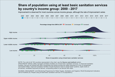
Worldwide Trend in Access to Sanitation Services
Using data from the WHO/UNICEF Joint Monitoring Programme for Water Supply, Sanitation and Hygiene obtained through the World Bank Open Data, an animated chart is created about the indicator “people using at least basic sanitation services (as a percent of population)” for 192 countries around the world from 2000 to 2017.
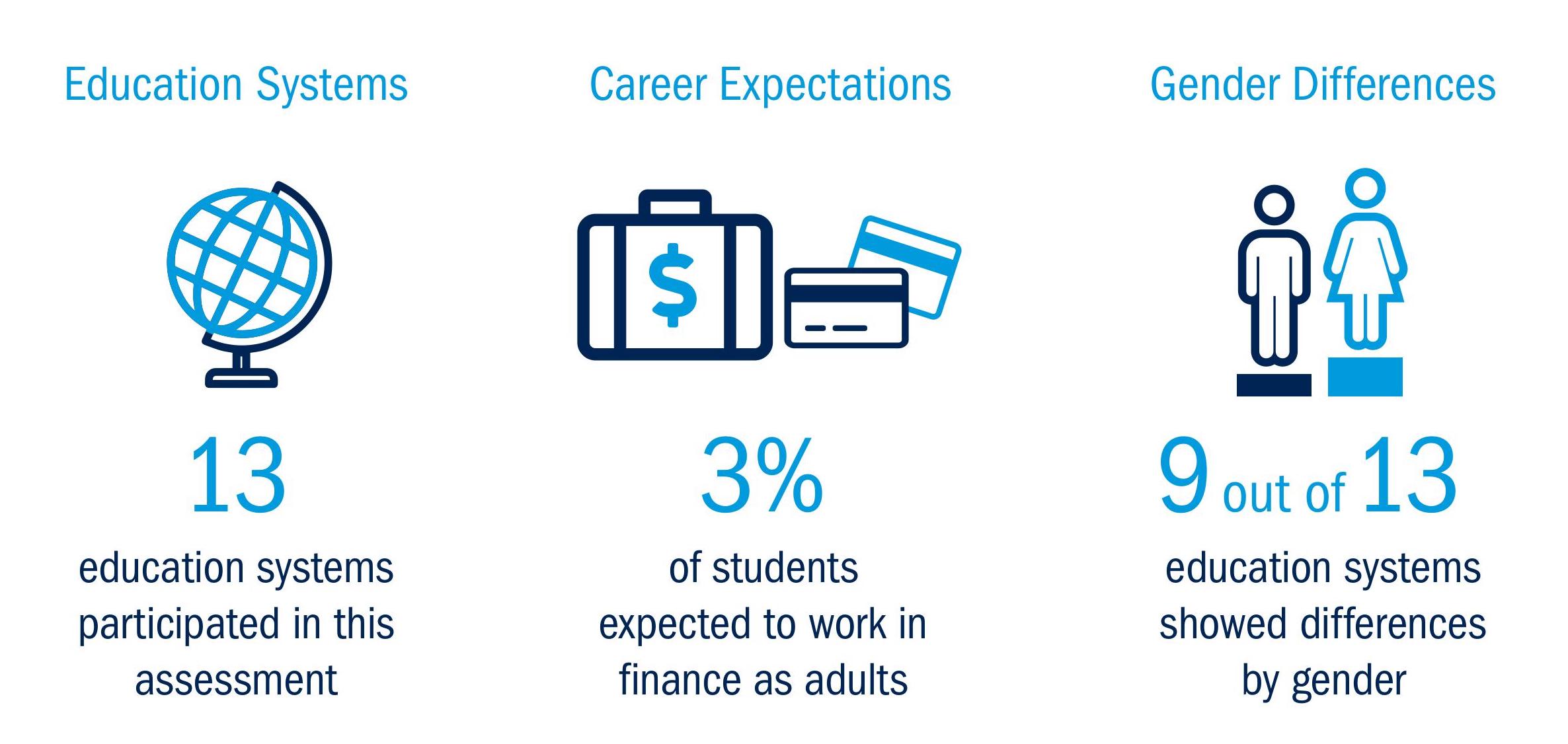
A Comparative Profile of 15-Year-Old Students Who Expect to Work in Finance
I compared 15-year-old students who reported career expectations in finance in 13 education systems using PISA Financial Literacy data and shared some of the findings.

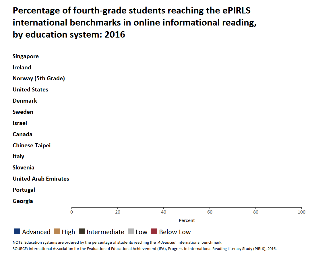
Who Clicks On Advertisements During an Online Reading Assessment?
Remember that time when you were reading an article online, where half-way through, there’s an advertisement that caught your eye, and 10 minutes later, you finished purchasing whatever that was and completely forgot about the article? The designers of ePIRLS surely remember such moments, so they put advertisements in many webpages from which students are supposed to read and collect information.
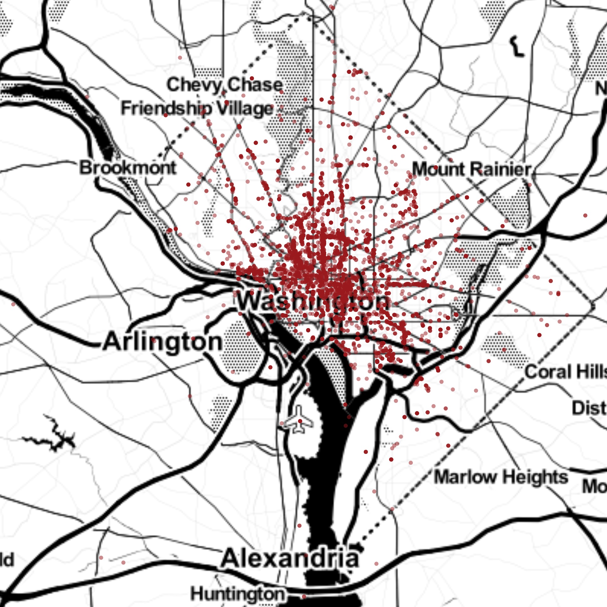
Instagram @WeThePeopleDC
2018-10-31 If you have some footprints in Washington D.C. and are active on Instagram, chances are that you may have heard of, or are currently following, the Instagram account @WeThePeopleDC. As its name hints, the account runs on an interesting model: each day, the handle is held by a different person living or working in the nation’s capital. The idea is that the account followers get to see the district through the eyes of Washingtonians of all backgrounds.