Exploring Data with a Rotating Globe
2024-05-05
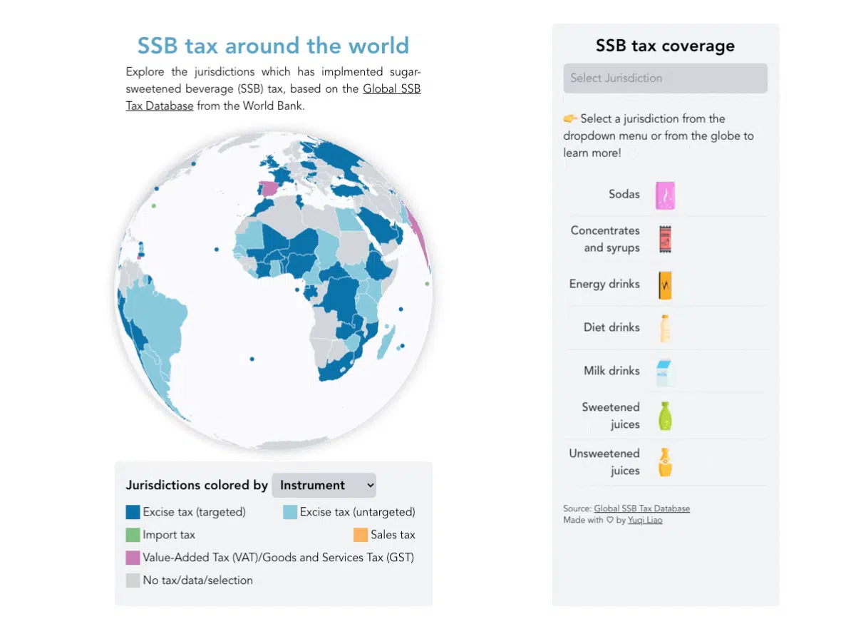
I’m excited to share my latest personal project: a rotating globe visualization of the Sugar-Sweetened Beverage (SSB) Tax database. You can check it out at https://ssbtax.vercel.app/.
My Inspiration
Last year, I had the opportunity to contribute to an online data visualization project for the World Bank focusing on the SSB Tax database (You can read more about it here). On the landing page of that project, we used two ways to visualize the SSB tax on a world map - one is a tile-grid map that gives each jurisdiction equal representation, and the other is a traditional choropleth map using the geoEqualEarth projection. However, I wanted to explore new ways of representing this global data.
As an aspiring data visualization developer, I took an online data viz course, Better Data Visualizations with Svelte, by Connor Rothschild, and I highly recommend it! Connor taught about creating a rotating globe, which I thought is a very cool way to visualize worldwide data, so I wanted to apply what I learned to this project.
My Process
Goals-Setting
For this project, my main goals were twofold. One was to implement the rotating globe technique as discussed above, and the other was to challenge myself in full-stack development. While I’ve been involved in data visualization projects before, I wanted to handle everything from design to deployment this time.
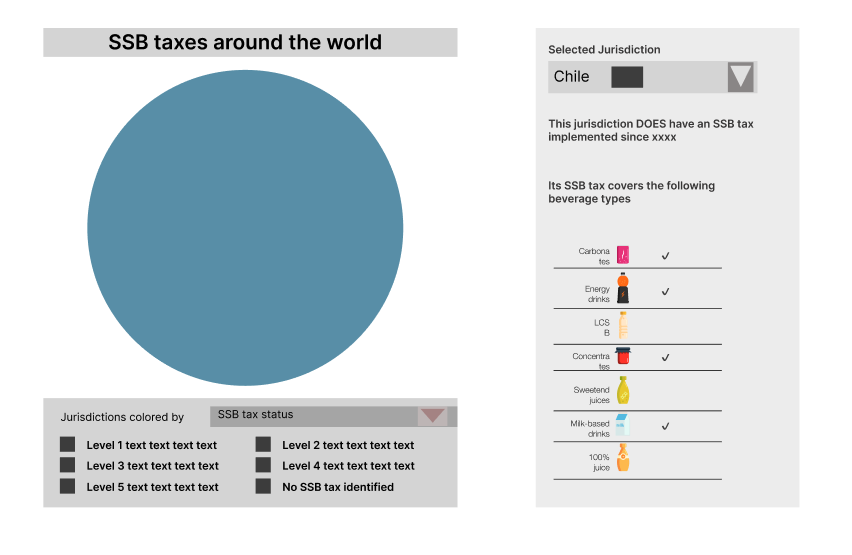
Design
I started by creating wireframes in Figma. I wanted the visualization to be interactive, so I designed a dropdown menu for the legend to allow the rotating globe to convey more information about the SSB tax database. I also decided to use the right sidebar space to highlight beverage types covered by the SSB tax in each jurisdiction.
Development
Following Connor’s tutorial, I set up the code and began development. Along the way, I encountered several challenges, but with perseverance and assistance from ChatGPT, I managed to overcome them. My experience with ChatGPT taught me that asking good questions is more likely to get a good response, and the process of forming a good question usually leads me to find a solution on my own.
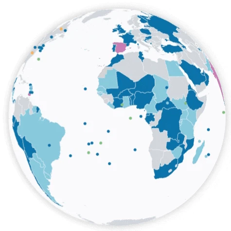
One notable development challenge was accurately plotting small jurisdictions on the rotating globe. The issue was that small jurisdictions (e.g., Caribbean island countries) represented by dots continued to appear on the rotating globe even when they were “behind the globe,” making the globe look very dizzy and messy, such as the following.
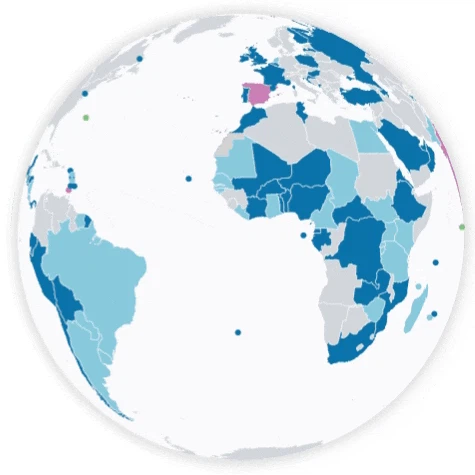
After many trials and errors, and inspired by the solution in this post, I solved it by implementing a custom function to adjust dot visibility based on their distance from the globe’s center. With such an adjustment, the following globe rotates correctly!
Deployment
After ironing out the issues, I deployed the project on Vercel.
Wrapping Up
Besides the technical issues discussed, one of the biggest challenges I faced while working on this project was knowing when to stop. Without external deadlines, I found myself endlessly tweaking and refining. Eventually, I had to remind myself that perfection is the enemy of done and decided to share the project. :)
In conclusion, I had fun working on this project and learned a ton along the way. I’m eager to hear your thoughts and feedback! Feel free to explore the visualization and drop me a message with any suggestions or ideas!
Happy visualizing!